How to Use Gemini to Interpret Wi-Fi Survey and Heatmap Data
How to read a wireless site survey report with AI — the metrics that matter, why more access points often make it worse, and the four things only a physical survey can find.
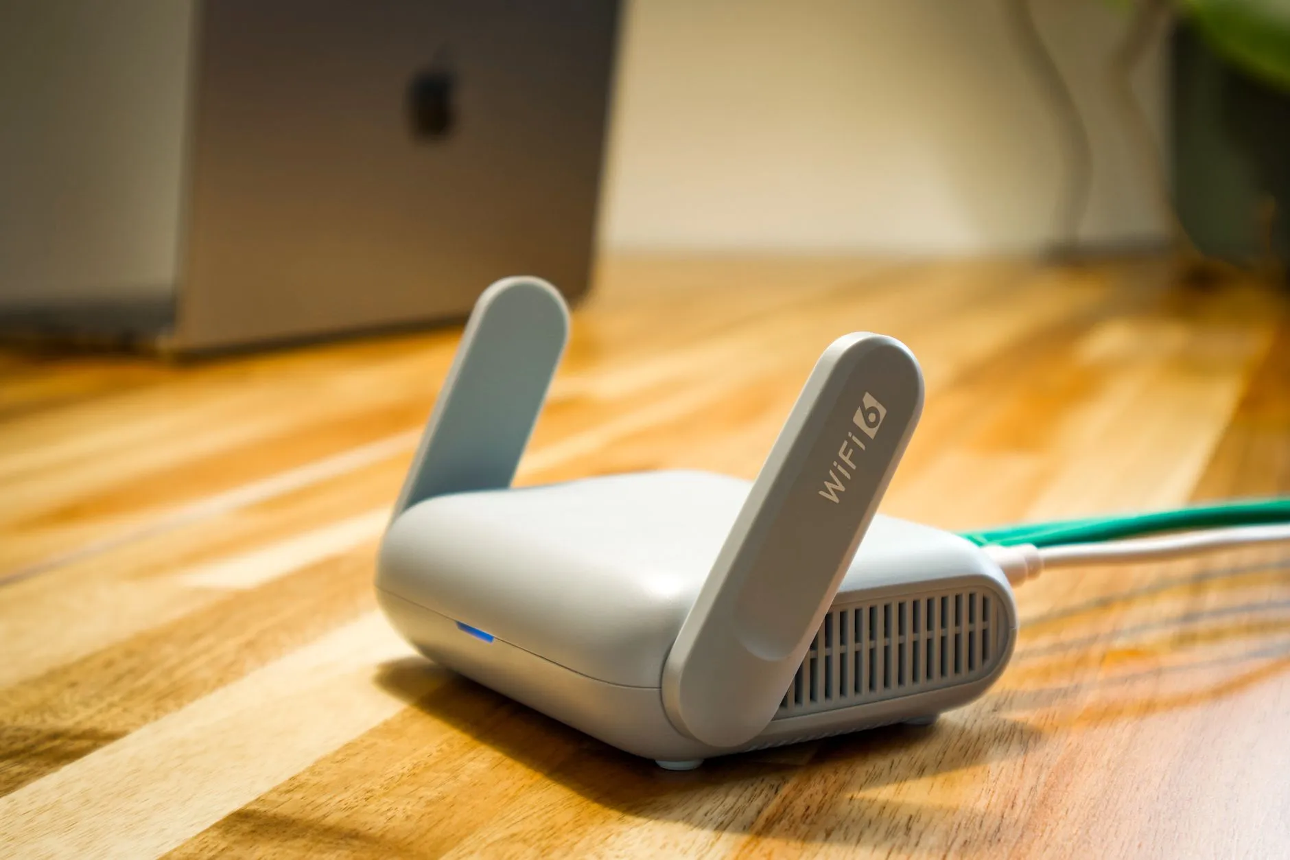
The short answer: Export the numbers behind the heatmap — RSSI, SNR, channel utilisation, retry rates, client lists — rather than screenshotting the picture, and ask Gemini to reconcile them against your actual complaint log. It will narrow "the Wi-Fi is bad" to two or three testable causes in an afternoon. It cannot detect the microwave oven, the metal-clad partition, or anything else that only exists in the building.
Every IT manager has received the same message. "The Wi-Fi is slow." No floor, no time, no device, no idea whether it is one person or forty. And somewhere in a shared drive there is a survey report from a vendor, or a controller dashboard full of graphs, that was supposed to answer exactly this.
The report is not the problem. The problem is that a wireless survey report is written by and for RF engineers, and the person holding it is usually an IT generalist who owns twelve other systems. The numbers are all there. The translation layer is missing.
That is a good use for a language model — not because wireless is easy, but because most of the gap here is vocabulary and cross-referencing, and those are exactly what a model does well. What follows is how to get real value out of it, and an honest account of the large category of causes it will never find.
Why "The Wi-Fi Is Slow" Is Almost Never a Coverage Problem
The instinct is to assume weak signal, and the instinct is usually wrong. Coverage is the easiest thing to fix and therefore the thing most often already fixed.
The more common causes are contention and interference. If four access points on the same floor are all broadcasting on channel 6, they are not adding capacity — they are queuing for the same airtime. Wireless is a shared medium: only one device transmits at a time on a given channel in a given space, and every additional radio on that channel makes the queue longer.
Then there is the client side. A laptop with a strong signal and a saturated channel gets poor throughput. A ten-year-old barcode scanner on 802.11n forces slower transmissions that consume disproportionate airtime, degrading everyone around it. And a "sticky" client that clings to an access point two rooms away, rather than roaming to the one overhead, has excellent coverage and a terrible experience.
None of this shows up as a hole in a coverage heatmap. All of it shows up in the tabular data underneath — which is why the picture is the least useful part of the report.
The Numbers in a Survey Report and What They Actually Mean
RSSI, SNR, channel utilisation, and client capability
RSSI is received signal strength in dBm, always negative, and closer to zero is stronger. As a rough working reference, around -65 dBm or better is a comfortable target for reliable data and voice; approaching -70 dBm and below, performance degrades and clients start hunting for something better. Your own device mix and applications shift these numbers, so treat any published threshold as a starting point rather than a standard.
SNR is the gap between your signal and the noise floor, in dB, and it matters more than raw RSSI. A strong signal in a noisy environment performs worse than a moderate signal in a quiet one. Broadly, upper-teens dB is workable for data and the mid-twenties and above is what you want for voice and video.
Channel utilisation is the percentage of airtime already in use. This is the metric most often absent from the conversation and most often responsible for the complaint. High utilisation with strong signal is the classic signature of "great coverage, unusable network."
Co-channel and adjacent-channel interference are different problems. Co-channel means multiple access points politely sharing one channel and halving each other's capacity. Adjacent-channel means overlapping channels talking over each other, which is genuinely destructive. On 2.4 GHz there are only three non-overlapping 20 MHz channels, which is why 2.4 GHz in a dense office is often beyond saving.
Client capability caps everything. An access point cannot make a single-antenna handheld faster than a single-antenna handheld. Before specifying new hardware, it is worth knowing what the devices in the building can actually use — including whether 6 GHz is available to you at all, since regulatory allocation differs by market and needs checking locally rather than assuming.
Get the exports, not the screenshots
Gemini accepts images, so it will happily take a picture of a heatmap and say something plausible about it. Resist this. Reading colour gradients off a rendered image is inference on top of inference, and the confident-sounding output is the least trustworthy thing you can produce here.
Survey platforms and wireless controllers can export the underlying data as tables — per-measurement or per-client rows with signal, noise, channel, band, data rate, retry counts and utilisation. That is what to give it. Paired with a floor list, an access-point inventory with channel and power settings, and — critically — your helpdesk complaints with timestamps and locations, you have something worth reasoning over.
The complaint log is the ingredient people skip, and it is where the value is. Survey data describes the building; the ticket log describes the experience. Asking a model to find where those two disagree is a genuinely useful question that nobody has time to answer by hand.
A Worked Example — From a Heatmap and a Complaint Log to Three Probable Causes
A 240-person company occupies three floors of an office tower, with a small warehouse and packing area on a lower level. Complaints are constant and vague. A survey was commissioned eight months ago and filed.
Feeding in the survey export, the current access-point list with channels and transmit power, and six months of Wi-Fi-related tickets produces three candidate explanations rather than one.
First, the third floor has too many access points, not too few. Nine radios on one floor at high transmit power, several sharing channels, produce heavy co-channel interference. The heatmap looks superb — deep green everywhere — and the utilisation figures are poor. The likely fix is reducing power and re-planning channels, which costs nothing and feels counterintuitive to everyone who has been asked to approve more hardware.
Second, the warehouse complaints cluster in time, not in space. Tickets from the packing area concentrate between 11am and 1pm and are almost absent otherwise, with no corresponding change in signal or client count. Nothing in the survey explains this. It is a strong hint of an external interference source on a schedule — and identifying it requires a spectrum analyser on site, not a data export.
Third, a group of complaints traces to one device model. Cross-referencing tickets against the client table shows a specific handheld terminal generating a disproportionate share, all with low data rates and high retry counts. That is a device or driver problem wearing a network problem's clothing.
The point is not that the model solved the network. It produced three hypotheses, each with a cheap test attached, in place of one unfalsifiable complaint. Two of the three turned out to be right; the second needed an engineer with a spectrum analyser to close out.
AI-Assisted Interpretation vs a Professional Site Survey vs Adding More Access Points
- Understanding a report you already paid for — AI-assisted interpretation wins outright. This is translation and cross-referencing, and it costs an afternoon.
- Correlating complaints against measurements — AI-assisted interpretation wins. Nobody manually joins six months of tickets to a client table, which is precisely why the pattern sits there unnoticed.
- Finding non-Wi-Fi interference — A professional site survey wins, absolutely. Spectrum analysis detects energy that Wi-Fi adapters cannot see at all. No export contains it.
- Placement, mounting height, antenna choice, and physical obstruction — The professional survey wins. Signal behaviour through a fire door, a lift shaft, foil-backed insulation or racked stock is a measurement problem, not a reasoning problem.
- Validating that a design actually works after install — The survey wins. A post-installation validation walk is the only way to know what was built matches what was designed.
- Adding more access points — Wins only when the cause is genuinely coverage, and loses badly otherwise. In a dense, already-congested environment, more radios at default power make the problem worse while looking like action.
The sensible order is: interpret what you have, form hypotheses, apply the free fixes — power, channel plan, band steering, retiring legacy clients — and commission a survey when the remaining questions are physical. That sequence also makes the survey cheaper, because you arrive with specific questions instead of "please look at our Wi-Fi."
What No Model Can Do From an Export
Four categories, and they are not edge cases.
Non-Wi-Fi interference. Microwave ovens, some cordless phone systems, video senders, certain industrial and medical equipment, and badly shielded electronics all radiate in the same bands. Wi-Fi hardware cannot see them; it only sees the damage. Finding them requires a spectrum analyser in the room.
The building itself. Glass with metallic coating, concrete cores, foil-backed insulation, filing cabinets, and racking that is full in December and empty in January all change RF propagation. A survey measures this. Nothing in a data export describes it.
Where an access point can physically go. Cable routes, ceiling access, power, mounting constraints, aesthetics and landlord rules decide real designs at least as much as RF does.
What the data does not contain. Surveys are a snapshot. A quiet Sunday survey of a building that fails on Tuesday at 10am has measured the wrong moment, and no amount of analysis recovers a measurement that was never taken.
Getting This Right — Network Data, Floor-Plan Sensitivity, and When to Bring in IT
Three practical points before you export anything.
Client tables are personal data in disguise. MAC addresses, device hostnames — frequently "Jenny-iPhone" — and per-client session data are identifiable. Strip or pseudonymise hostnames, keep the mapping locally, and check the current data-handling and retention terms of the tier you are actually on rather than assuming a business account behaves like a consumer one.
Floor plans are physical-security documents. A drawing of your premises with equipment locations is worth protecting on its own terms, independent of any wireless question. Use zone codes rather than uploading the annotated plan whenever the analysis does not genuinely need the geometry.
The interpretation is the cheap half. Deciding what to change — and proving it worked — is engineering. Brocent's engineers run Ekahau Pro, AirMagnet and Chanalyzer for wireless site surveys across Asia, and this is exactly the boundary: a model can tell you which questions are worth measuring, and someone still has to walk the floor with a spectrum analyser to answer them. Our AI+ support practice and managed IT support sit either side of that work. Brocent has run managed IT across the region since our founding in Beijing in 2007, with headquarters in Singapore and a Hong Kong office since 2016. For what a professional survey actually delivers, see our Wi-Fi site survey services in Asia and this Ekahau survey engagement for a manufacturer.
Frequently Asked Questions
Can AI tell us where to put an access point?
Not credibly, and this is the most common thing people want from it. Placement depends on construction materials, ceiling height, mounting options, cable routes and measured propagation — none of which is in a data export. A model can tell you that a floor looks over-provisioned or that a zone has no measurements at all, which is a useful input to a design. It is not the design.
Is adding more access points ever the right fix?
Yes — when the cause is genuinely coverage, such as a new area, a warehouse extension, or a floor built out after the last survey. In an office already showing high channel utilisation and heavy co-channel interference, adding radios at default power usually makes things worse. The distinguishing evidence is utilisation and interference data, not the heatmap.
Does our controller export enough data to be worth analysing?
Usually yes. Most enterprise wireless platforms expose client lists, per-radio channel and power, channel utilisation, retry and error counts, and historical client data. That covers contention, client capability and roaming behaviour — three of the four common causes. The fourth, non-Wi-Fi interference, needs different instrumentation entirely.
When do we actually need a physical site survey?
When the questions left over are physical: a new site or fit-out, a change of use such as adding high-density meeting space, a warehouse with racking that moves, persistent problems that survive a channel and power re-plan, or a deployment that needs validating after install. Also when you are about to spend real money on hardware — a survey is cheap relative to buying the wrong design.
Is a floor plan sensitive information?
Treat it as such. It documents your physical layout, sometimes access points, server rooms and secure areas. Many organisations are relaxed about this until asked, at which point they are not. Reason over zone identifiers rather than uploading annotated architectural drawings unless the geometry genuinely matters to the question.
Can Gemini read a heatmap image directly?
It will accept the image and produce a fluent description of it, which is the trap. What you get back is an interpretation of colours in a rendered picture, not of the measurements behind them — the thresholds, the interpolation and the sampling density are all invisible. Use the tabular export as the source of truth, and the image only as context.
Where to Start
Pull last month's Wi-Fi tickets and your controller's client and utilisation data, and ask one narrow question: do the complaints line up with any measurable condition at that time and place? If they do, you have a hypothesis and a cheap test. If they do not, that is a finding too — it means the cause is not in the data, which is when a survey stops being a nice-to-have. Either way you will know which conversation you are in, and we are happy to have the second one: get in touch.
Share:
Ready to take action?
Turn these insights into a roadmap for your business.
Book a 15-minute no-obligation consultation with our APAC IT experts. We'll review your current setup and provide a tailored IT roadmap within 24 hours.
Free Checklist
10 Critical Checks Before Expanding IT to Greater China
PIPL compliance, network segmentation, bilingual helpdesk setup, and more — everything your IT team needs before Day 1 in China.
Request the checklist →📬 Monthly Asia IT Insights
China compliance updates, cybersecurity alerts, and IT tips for APAC teams — once a month.
No spam. Unsubscribe anytime.
Related Articles

Jul 20, 2026
Wi-Fi Site Survey Services in Asia: Ekahau Surveys, 6 GHz Coverage & Costs (2026 Guide)

Aug 12, 2026
How to Build a Cross-Border WireGuard Mesh Between Multi-Country ECS Servers in Two Hours, with Claude

Aug 09, 2026
How to Use Gemini to Organise and Search Google Shared Drives